Linnentown Memorial
Sculptural Monument
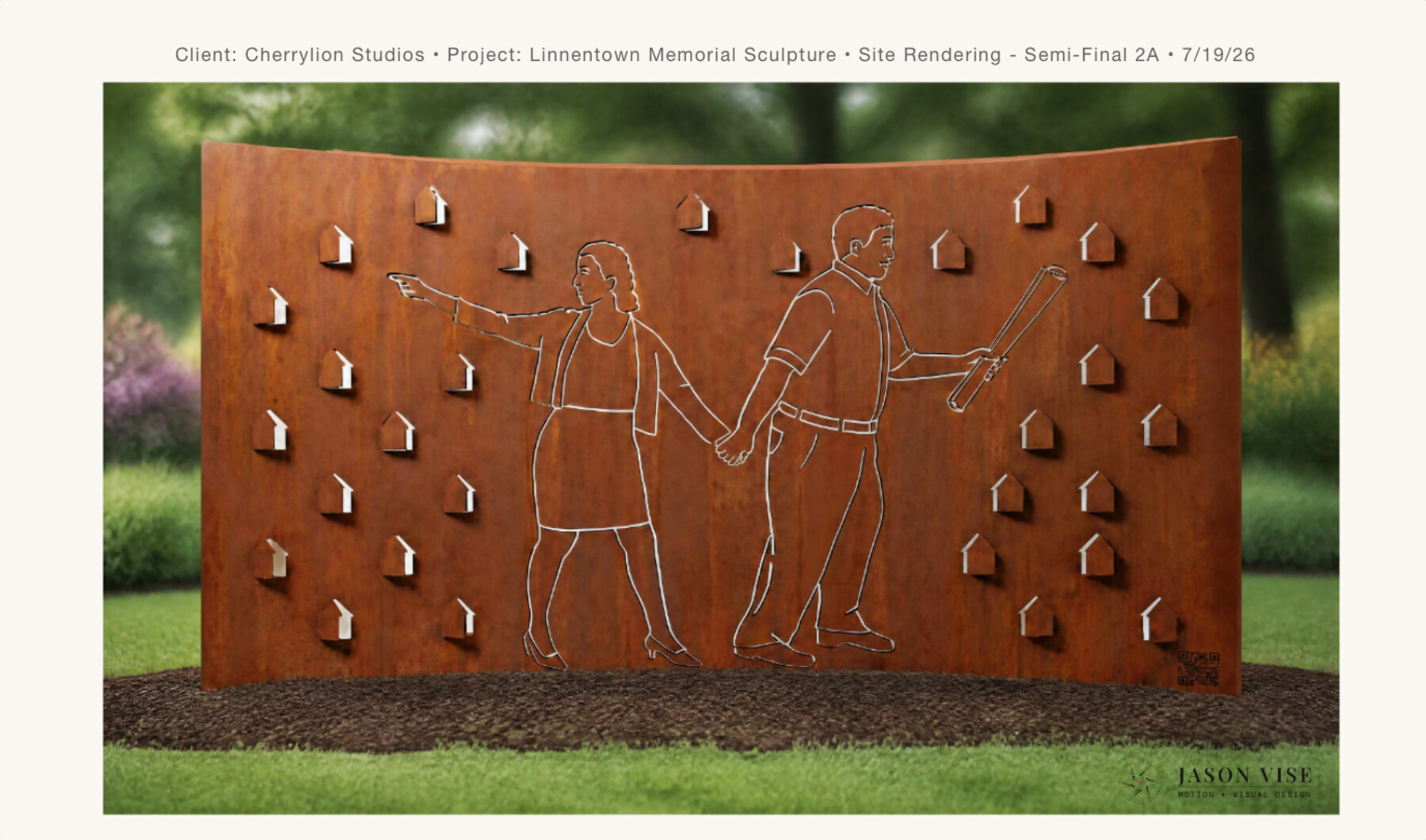 Site rendering — Semi-Final 2A · Cherrylion Studio / Jason Vise · July 2026
A neighborhood displaced.
A monument to hold its memory.
Linnentown was a thriving Black neighborhood in Athens, Georgia — a community of homeowners, families, and small businesses that occupied a wedge of land just west of downtown. In the 1960s, the University of Georgia exercised eminent domain and demolished the entire neighborhood to build student dormitories. Residents received below-market compensation and were displaced with no right of return. The streets were erased from the map.
Six decades later, a public art commission was opened to propose a permanent memorial on or near the original site. Cherrylion Studio, an Atlanta-based public art practice, invited JV to collaborate on the proposal: contributing the design concept and all visualization work, from initial renders to final competition imagery.
The design problem wasn't purely aesthetic. It was about finding a form that could hold grief, community, and insistence simultaneously — and hold it in mild steel, outdoors, for generations.
Constraints
The form needed to read as monumental at pedestrian scale, survive exposed outdoor conditions in mild steel without requiring weathering-steel patina, and communicate clearly to passersby without explanatory text. It needed to foreground the people of Linnentown — not the abstraction of loss — while accommodating a functional QR code linking to historical records.
Reading the record before designing the response.
The figure references came from a photo session with the two subjects who would serve as models for the life-size silhouettes. The woman points back — toward the neighborhood, toward what was taken. The man holds rolled plans — the documentation of what existed. Their inner hands are joined, holding across that gesture of witness and record. The line drawing translation was the first step toward the cut-through form the sculpture would require.
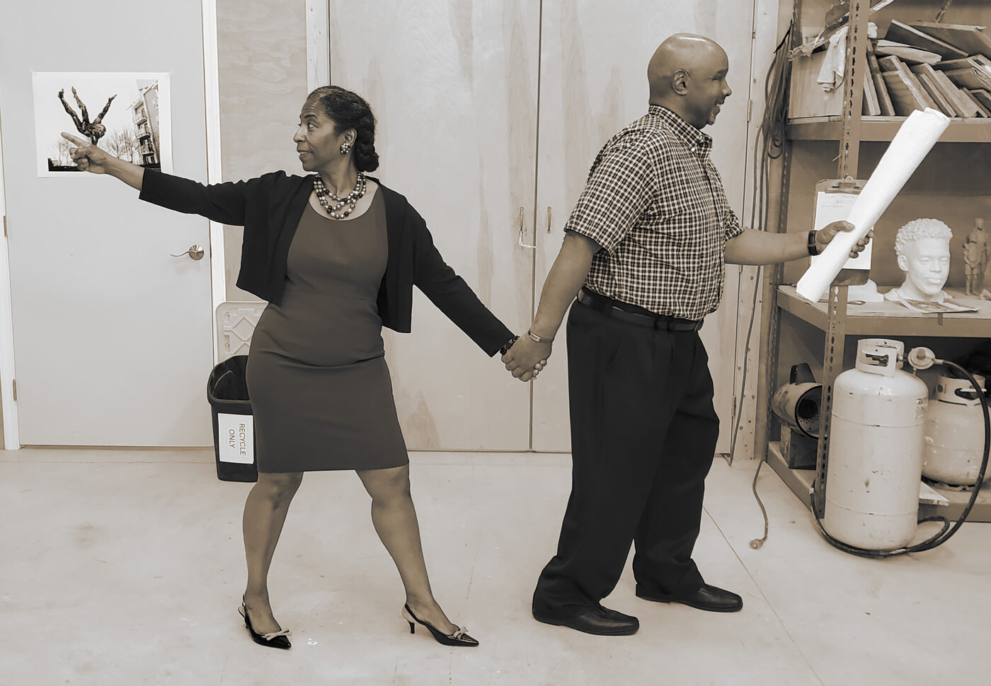
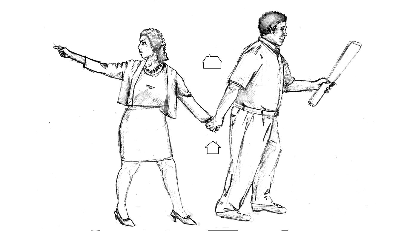
From reference to render: the production workflow.
The visualization work ran across multiple rounds of iteration, each one tightening the relationship between the physical proposal and its rendered representation. The core challenge was producing imagery that read as documentary — as evidence of a real sculpture — rather than as speculative concept art. Material honesty was the north star for every generation prompt.
Source intake + concept formalization
Consolidated figure reference photos, house silhouette studies, survey map, and precedent imagery. Translated conceptual intent into specific formal constraints: panel count, silhouette count, house density, curve geometry, and material specification. This documentation governed all downstream prompt writing.
Initial generation rounds — form finding
Early rounds in Higgsfield established the base form: the curved panel, the two figures, the overall composition. Reference images were passed via media array to anchor figure posture. Each round identified specific elements to correct — a surgical, targeted approach over wholesale regeneration.
House field distribution — custom script
A custom Python script (addhouses_c2c.py) transferred the house centroid field from a reference panel onto the clean plate using delta/shading overlay with Gaussian falloff, preserving the figures, QR corner, and panel edges. This ensured the ~50 house forms were spatially consistent across render variants.
Material refinement
Generation prompts were tuned specifically for mild steel — a cooler, more neutral surface than weathering (Corten) steel. Avoiding the warm orange-brown rust patina that reads as Corten was a critical distinction, both for accuracy to the proposal and for avoiding visual association with existing precedents.
Compositing pass
A Photoshop cleanup pass followed each generation round — addressing edge artifacts, reinforcing shadow logic, and unifying the plate reads across a four-panel seam that the proposal specified would be ground flush. The goal was a single seamless surface reading.
Progression documentation
Round-by-round renders were compiled into a sequenced, captioned PDF documenting the visual evolution from initial concept to final submission imagery. Eight line items, approximately 16 hours of production work across Generation, Compositing, and Technical categories.
Render Progression
The sequence below documents the visual arc from initial clean plate through to site-context final. Each round addressed a specific set of corrections — form, material, house distribution — without disturbing what was already working.
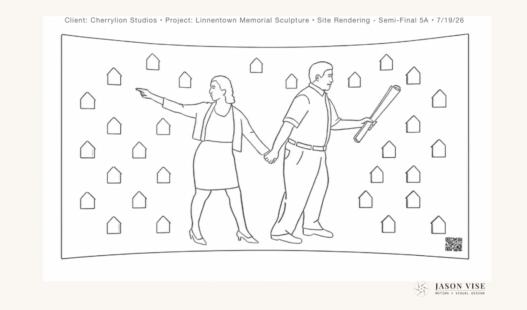 Round 1 — 5A Wireframe
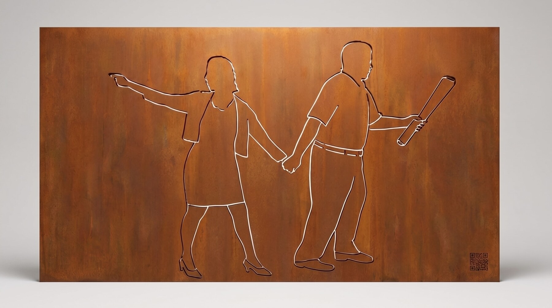 Round 2 — Clean Plate
Final — 2A Site Context
Round 2 — Clean Plate
Final — 2A Site Context
What the work produced.
The final deliverables comprised: a suite of proposal-quality renders showing the sculptural monument in isolation and in ambient site context; a fabrication diagram with annotated arc geometry, panel dimensions, and curve specifications; a process progression PDF; and supporting documentation including invoice, deliverables table, and project description for portfolio use.
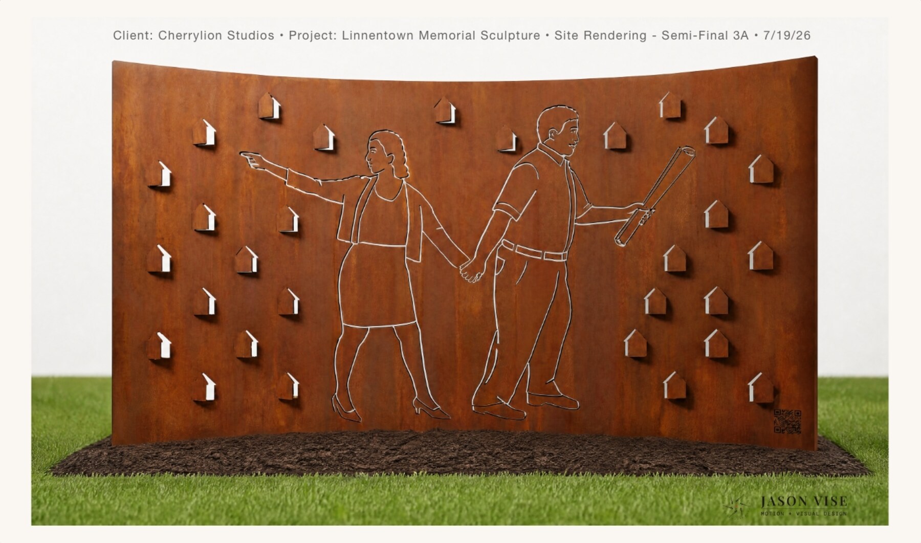
The competition entry was submitted in collaboration with Cherrylion Studio. The proposal advanced to the finalist round in a field evaluated for design merit, community resonance, and fabrication viability.
A finalist result in a public art competition with genuine cultural stakes is a meaningful credential. The work is documented. The process is repeatable. The collaboration is open.
What the renders had to do
Competition renders for public art serve a specific persuasive function: they must help a selection committee — typically composed of community members, city officials, and arts administrators, not designers — visualize a proposed work clearly enough to vote for it with confidence. That means the imagery must read as evidence of craft and intent, not as a speculative mood board.
Every prompt decision, compositing choice, and material specification in this project served that goal. The mild steel surface had to read as material, not as a rendering artifact. The figures had to read as people, not as generic silhouettes. The house forms had to distribute across the panel with the density and irregularity of a real community — not the regularity of a pattern.
What the project taught.
Accuracy over embellishment
Every factual error — wrong material, nonexistent design element — costs trust with the collaborating artist and, potentially, with a selection committee. The discipline of staying precisely true to the proposal spec (mild steel, not Corten; house forms, not a street grid) is a professional practice, not a constraint.
Surgical iteration
The most productive generation rounds identified specific elements to fix and left everything else untouched. Wholesale regeneration destroys good solutions accidentally. Targeted prompting preserves what's working while correcting what isn't.
AI renders as evidence, not illustration
For a public art competition, renders function as legal-adjacent evidence of intent. They need to be honest about the form proposed. The QR code visible in renders is a visual placeholder — noted clearly in all documentation. A real scannable QR requires a live URL, and that distinction matters.
Scripting as production tool
The custom Python script for house centroid transfer was the difference between consistent house distribution across renders and an inconsistency that would have read as incoherence in a side-by-side progression. Small automation bets pay outsized production dividends.
Composite vs. generative tradeoffs
Some visual problems are better solved in Photoshop than by grinding through generation rounds. Recognizing when to switch methods — rather than persisting with a low-probability workflow — is a core skill for this practice model.